T distribution
T distribution
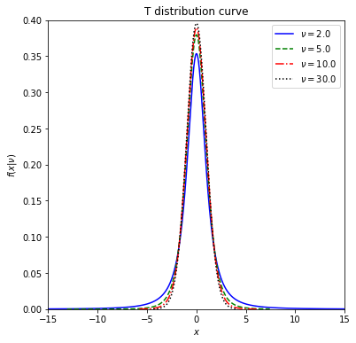
Let’s investigate how shape of the t distribution curve look likes.
# import required libraries
import numpy as np
import matplotlib.pyplot as plt
import scipy.stats as stats
from IPython.display import display
Let’s now investigate how shape of the t distribution curve changes with respect to degrees of freedom (\(\nu\)). We will define a function first to simplify our calculations.
# define a Python function with three parameters

def t_dist_curve(dof, ltype, col):

    fig, ax = plt.subplots(figsize = (6, 6))

    #use zip for parallel iteration
    for d, l, cl in zip(dof, ltype, col):
        #generate 10000 random variables for given degrees of freedom
        x = stats.t.rvs(df = d, size = 10000)
        x1 = np.sort(x)
        plt.plot(x1, stats.t.pdf(x1, df = d),
                 ls = l, c = cl, label = r'$\nu=%.1f$' % (d))

    plt.xlim(-15, 15)
    plt.ylim(0, 0.4)
    plt.xlabel('$x$')
    plt.ylabel(r'$f(x|\nu)$')
    plt.title('T distribution curve')
    plt.legend(loc='upper right')
    plt.show()
Now play with the function to see the changes on the normal distribution curve.
## change the following values as you wish
## define the input arguments (values of the parameters)
dof_values = [2, 5, 10, 30]
linestyles = ['-', '--', '-.', ':']
colors = ['blue', 'green','red','black']

t_curve = t_dist_curve(dof = dof_values, ltype = linestyles, col = colors)

display(t_curve)
None
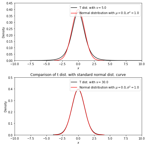
Compare the standard normal distribution cuver with t distribution curver with df = 30.
fig, ax = plt.subplots(figsize = (7, 7))


plt.subplot(2, 1, 1)
d1 = 5
#generate 10000 random variables for given degrees of freedom
x1 = stats.t.rvs(df = d1, size = 10000)
x1 = np.sort(x1)
plt.plot(x1, stats.t.pdf(x1, df = d1), c ='black', label = r'T dist. with $\nu=%.1f$' % (d1))

mu = 0
sigma = 1
x3 = stats.norm.rvs(loc = mu, scale = sigma, size = 10000)
x3 = np.sort(x3)

plt.plot(x3, stats.norm.pdf(x3, loc = mu, scale = sigma), c ='red', label = r'Normal distribution with $\mu=%.1f,\sigma^2=%.1f$' % (mu, sigma*sigma))
plt.ylim(0, 0.5)
plt.ylim(0, 0.45)
plt.xlim(-10, 10)
plt.xlabel('$x$')
plt.ylabel('Density')
plt.legend(loc='upper right')


plt.subplot(2, 1, 2)
d2 = 30
#generate 10000 random variables for given degrees of freedom
x2 = stats.t.rvs(df = d2, size = 10000)
x2 = np.sort(x2)
plt.plot(x2, stats.t.pdf(x2, df = d2), c ='black', label = r'T dist. with $\nu=%.1f$' % (d2))
plt.plot(x3, stats.norm.pdf(x3, loc = mu, scale = sigma), c ='red', label = r'Normal distribution with $\mu=%.1f,\sigma^2=%.1f$' % (mu, sigma*sigma))
plt.ylim(0, 0.5)
plt.xlim(-10, 10)
plt.xlabel('$x$')
plt.ylabel('Density')
plt.legend(loc='upper right')

plt.title('Comparison of t dist. with standard normal dist. curve')
fig.tight_layout()
plt.show()
Calculate probabilities associated with t distribution with ‘stats.t.cdf(x, df)’.
1-stats.t.cdf(2.228, df = 10)
0.02500588590855568